Biosay
Brand • Product Design • Web
Biosay is redefining wellbeing through the power of data and community. By combining personalised biometric tracking with anonymised data sharing, Biosay helps you take control of your own health while contributing to a collective understanding that benefits everyone.
Future User Interface
To help the brand connect with its audience, Founder and CEO Rachael Donalds, MPA, MS, engaged me to craft an immersive product experience inspired by the rich, layered visual language of Sci-Fi interfaces. Having co-founded Territory Studio, I understood the cinematic world she wanted to evoke. The challenge lay in translating that complexity into an experience that feels intuitive, elegant, and effortless to use.
Brand+Product Experience
Working closely with the founder, we developed the brand and product in tandem, ensuring they grew as one, each reinforcing a shared vision. The design language fuses the precision of future-tech with a serene, confident tone of wellbeing. Biosay tells a story of personal insight and collective benefit, where self-awareness and shared data drive a healthier, more connected community.
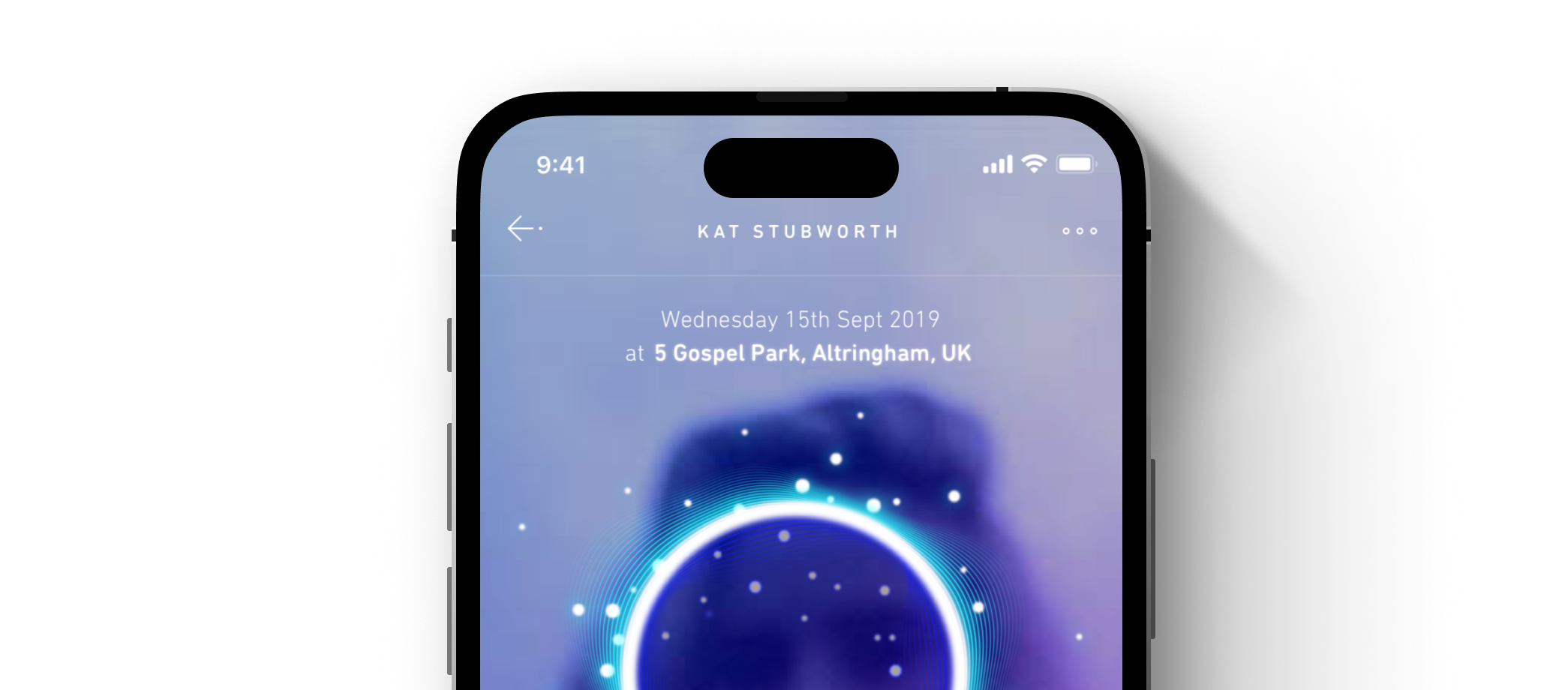
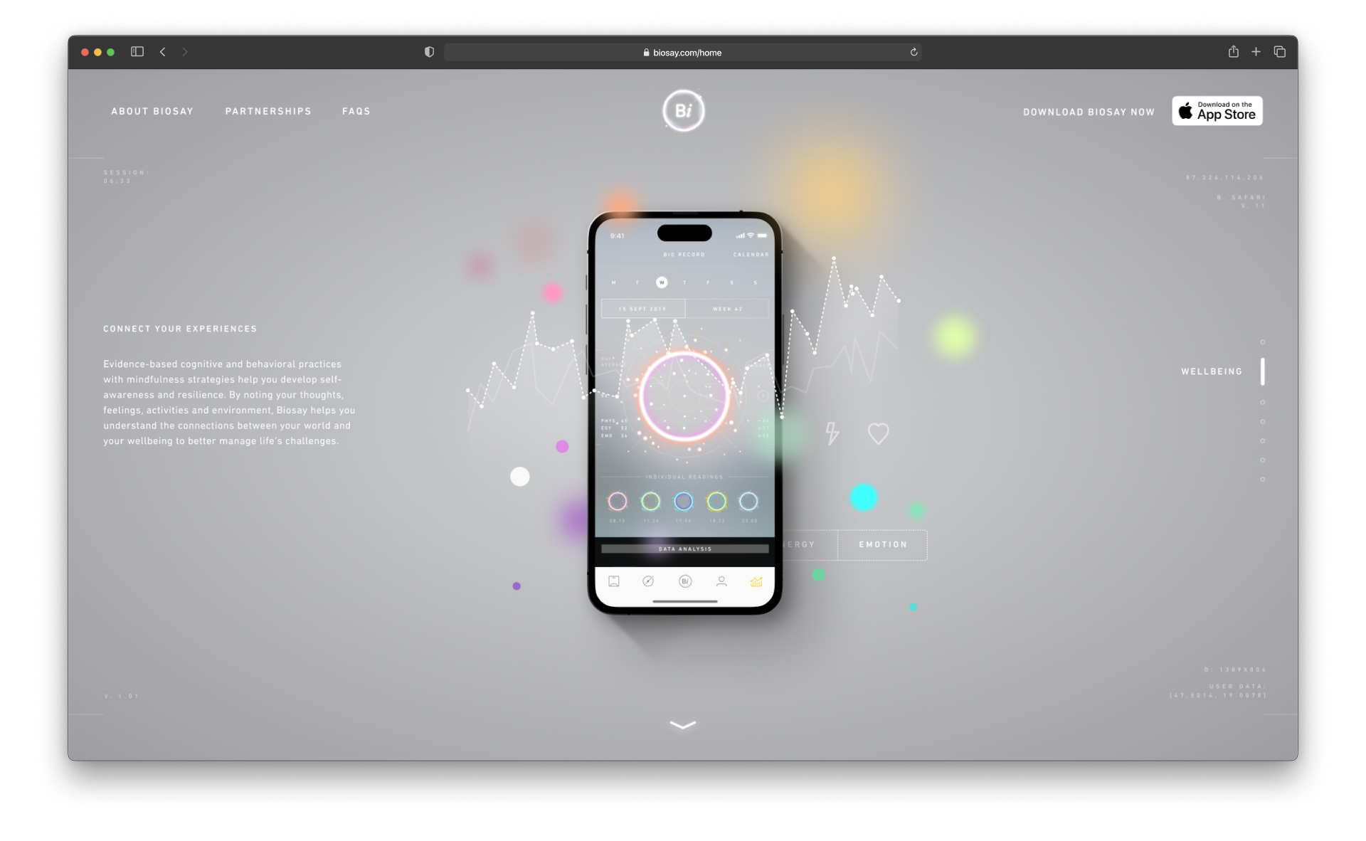
Science Meets Science Fiction
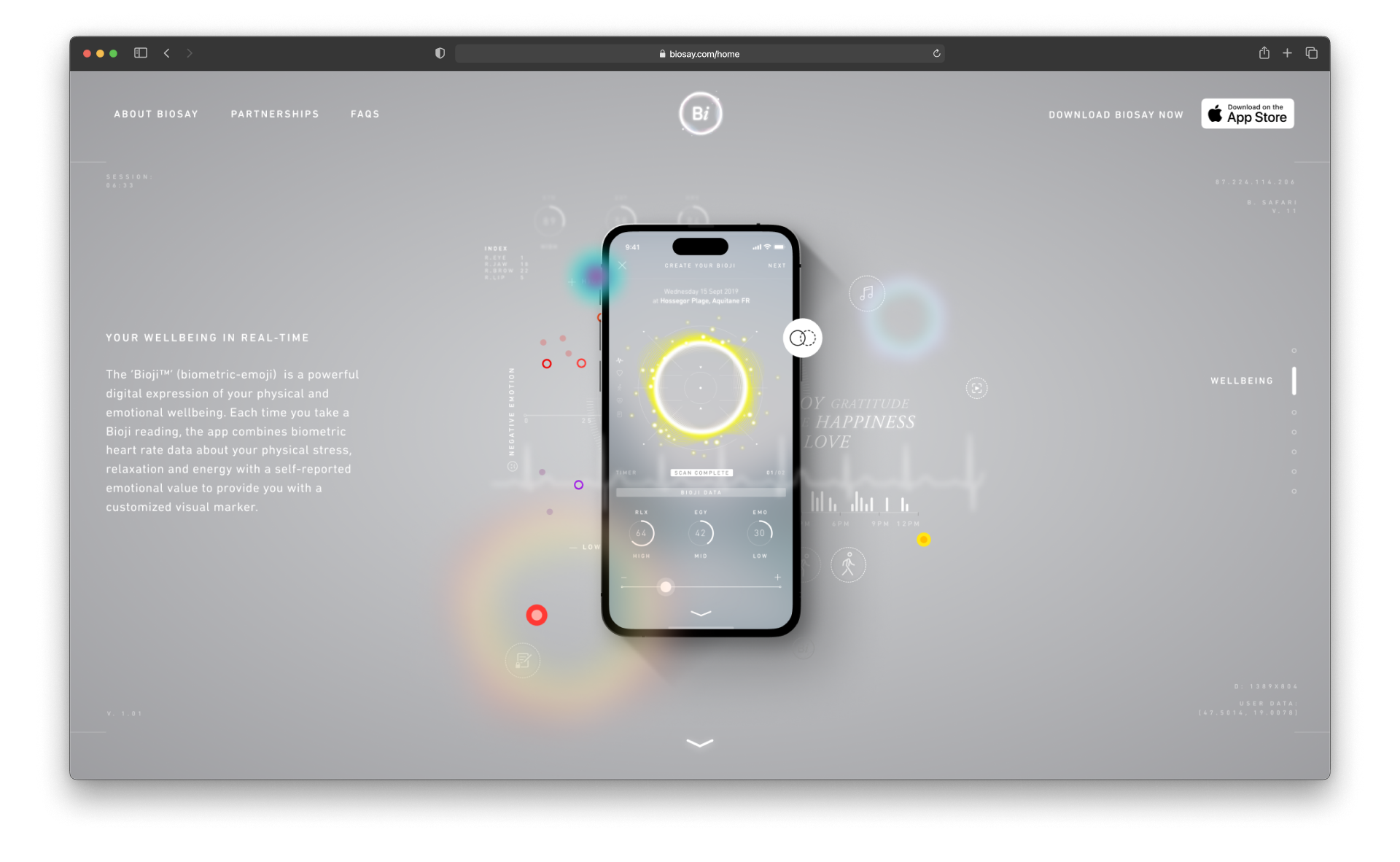
At the heart of the app experience is a dynamic, pulsing ring of light known as the Bioji. Generated from each user’s biometric data in real time, this ethereal form visualises mood, emotional state and energy through subtle shifts in movement, colour, and scale.
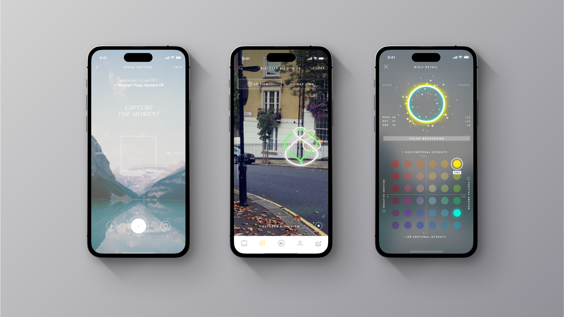
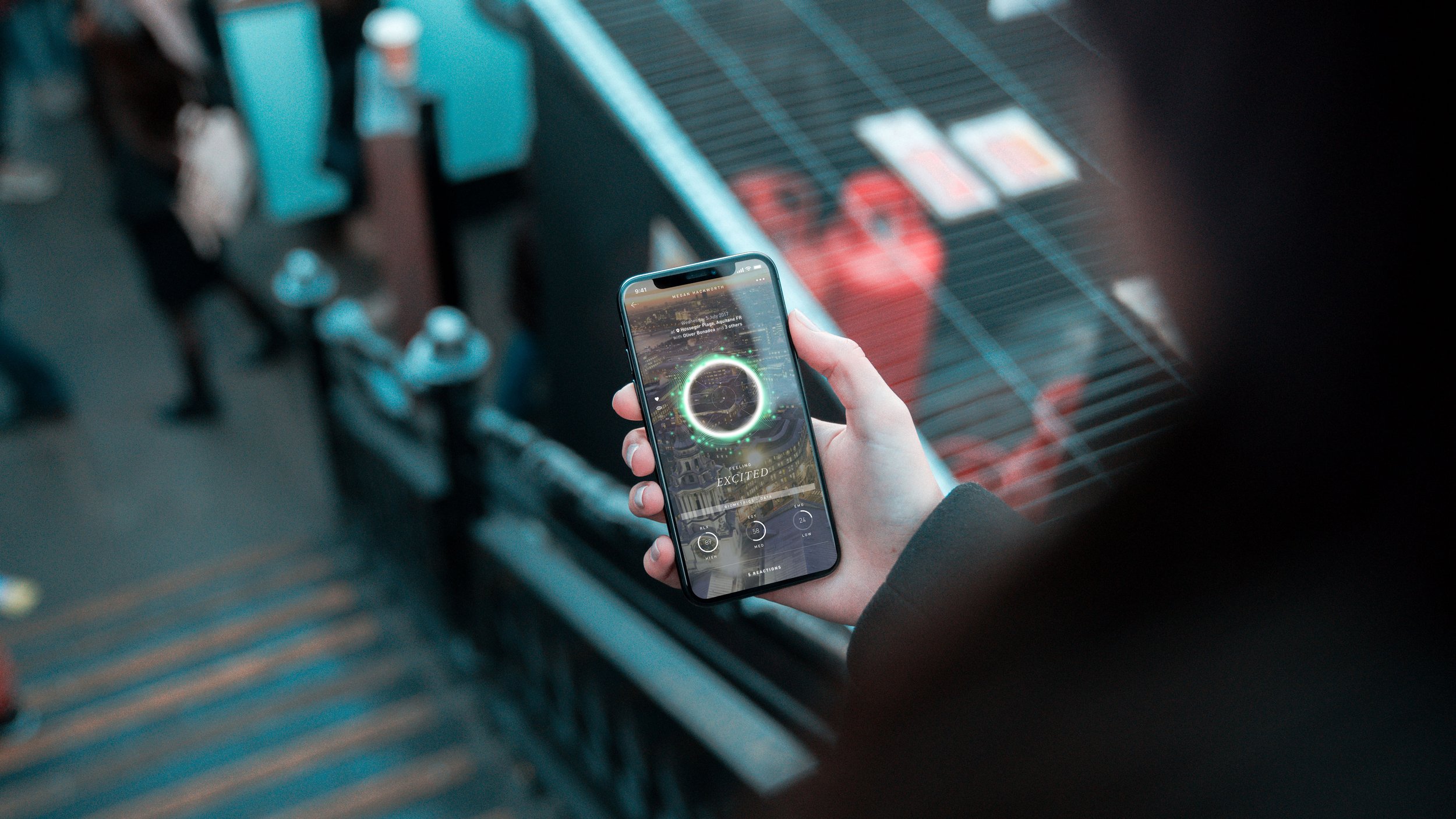
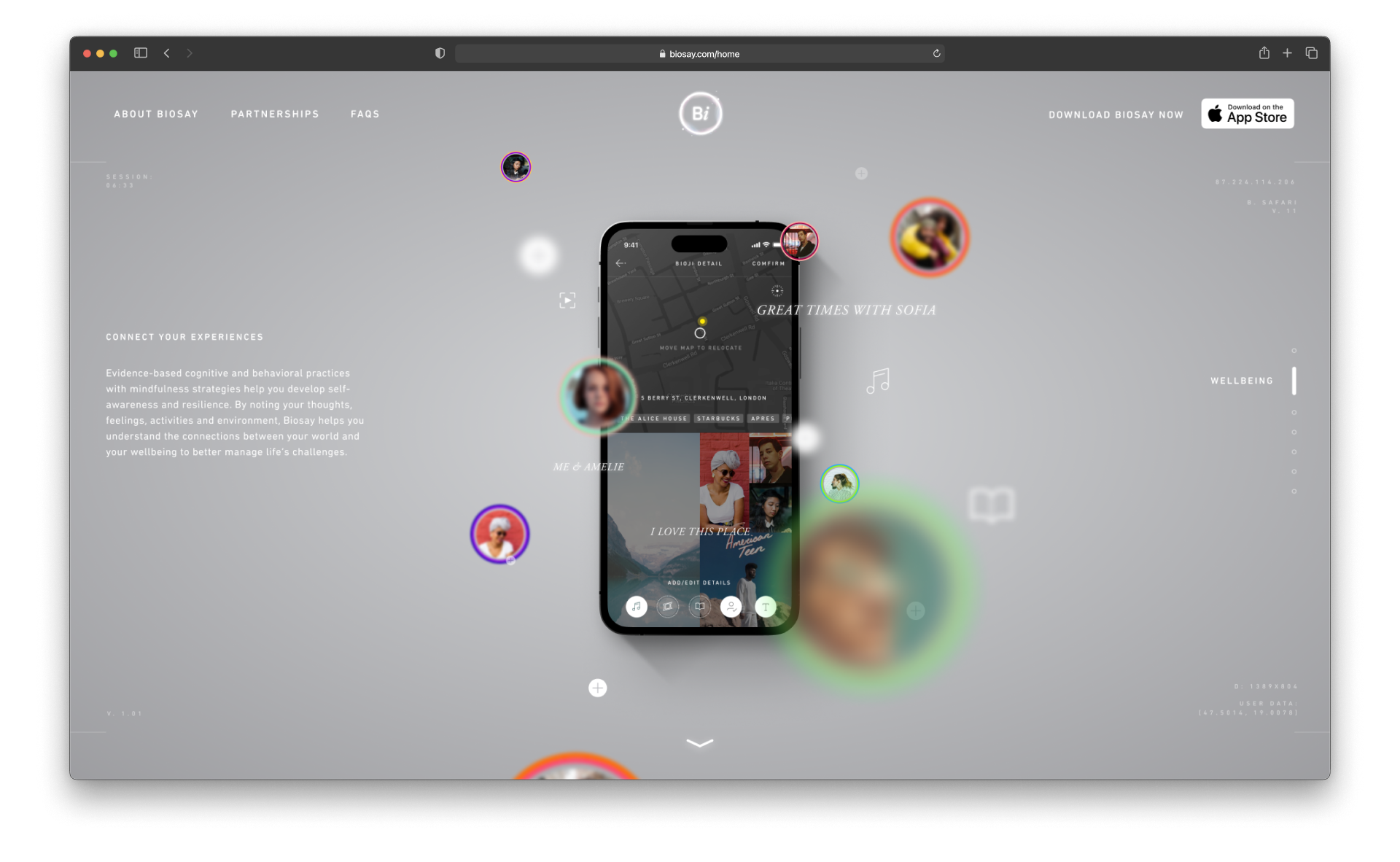
Merging the Digital and Real Worlds
To bring Biosay into the real world, I created a geo-tagged 3D version of the Bioji, allowing users to experience their biometric data as luminous, living forms in augmented reality—transforming personal insight into a shared spatial expression of collective wellbeing.
Animation and transitions
Some animated screen recordings to get the sense of the brand and product experience
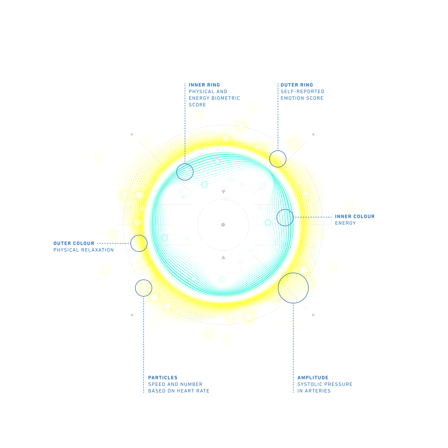
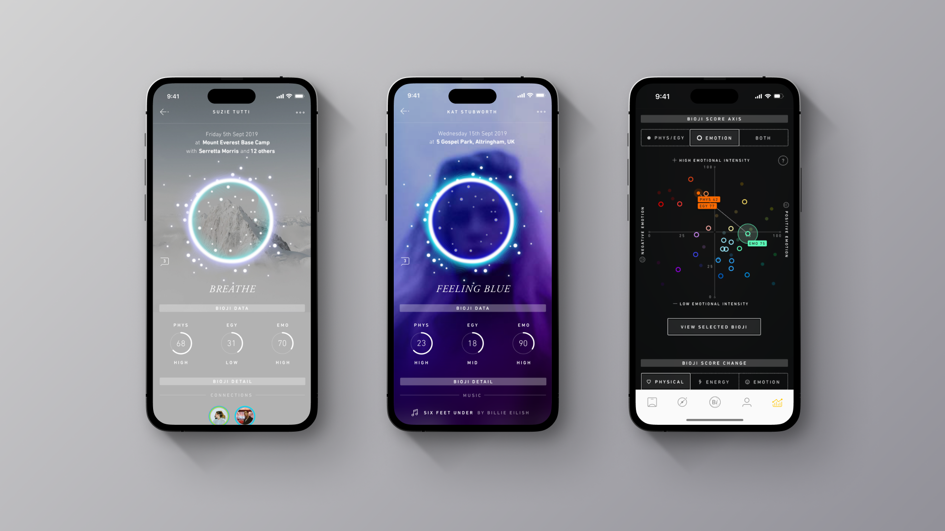
The Anatomy of a Bioji
The Bioji is a digital reflection of the human condition in real time. Using proprietary technology developed by the Founder, the app analyses biometric data, such as heart rate variability, to interpret an individual’s stress, energy, and emotional state. These readings are then mapped across multiple axes to define the Bioji’s colour, scale, and motion. The diagram illustrates how each element comes together to form this unique visual signature.
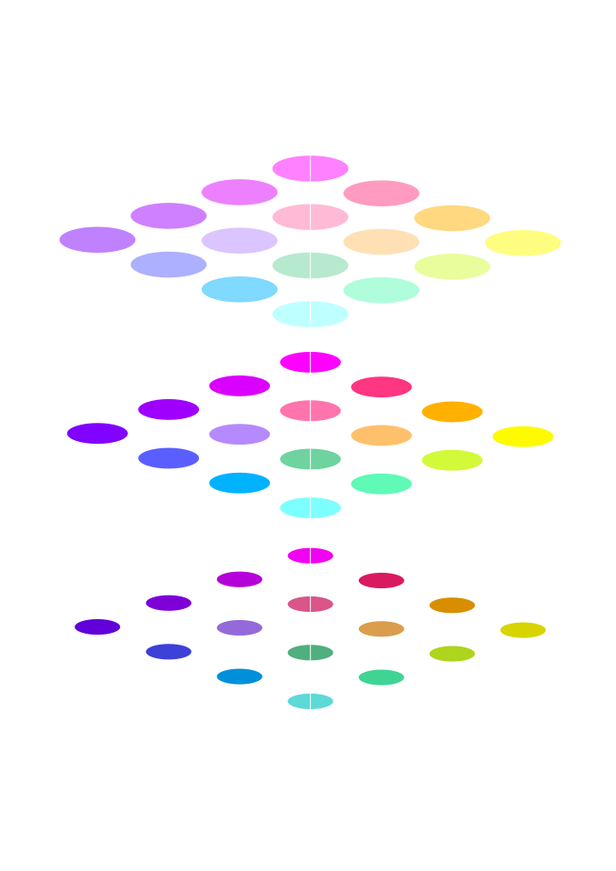
Defining Mood with Colour Across 3-Axes
Colour is central to the Bioji experience, appearing throughout the app, from mapping and analytics to the visualisation itself. To determine which colours are generated, I developed a three-axis system: a colour grid to define the core hue, and a vibrancy scale to represent emotional intensity and mood variation.

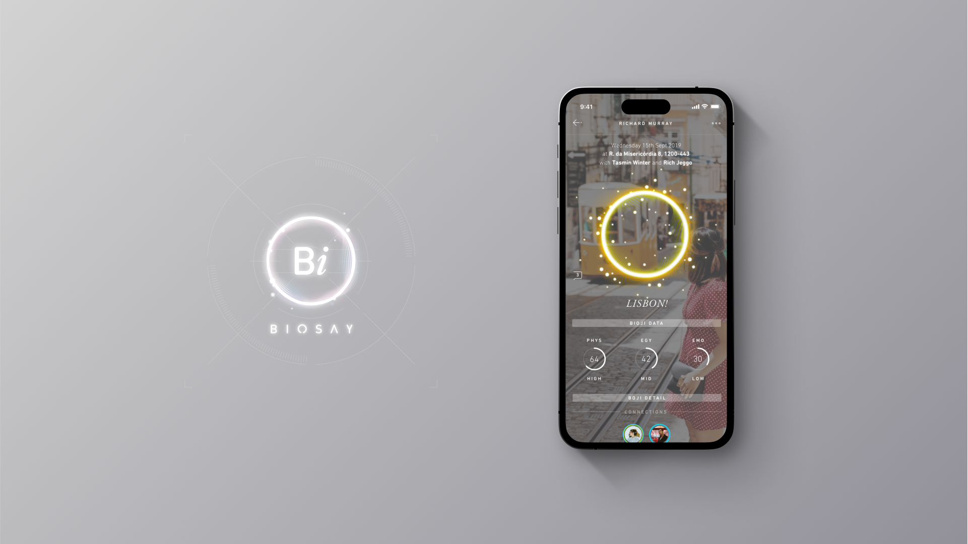
Brand Identity
The Biosay logo captures the brand’s focus on innovation and wellbeing. Blending organic shapes with a future-tech aesthetic, it expresses the harmony between nature and technology. The colour palette conveys serenity and trust, establishing the logo as a distinctive mark of progress and integrity in biotechnology.
“We built Biosay to capture the complexity of human experience in real time in order to help people and businesses better understand themselves and each other”