The Guardian Icons
Icon Design
Commissioned by The Guardian to support a major cross-platform brand and editorial refresh, I designed a cohesive set of icons rooted in the same design principles as their bespoke Egyptian typeface, creating a visual language that feels unmistakably Guardian.
Part of the family
When The Guardian’s Executive Creative Director, Alex Breuer, invited me to design an iconography set for their newly refreshed system, I looked first to their typography for inspiration. By echoing its proportions and rhythm, the icons became a natural continuation of the type family, seamlessly unifying the brand’s visual expression across platforms.
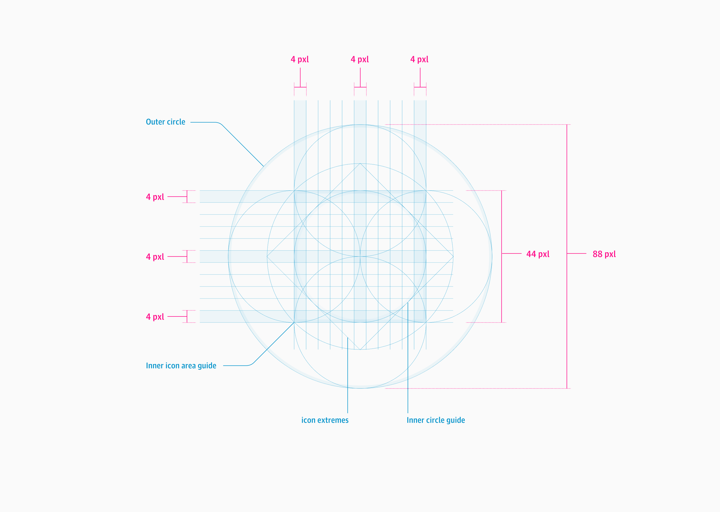
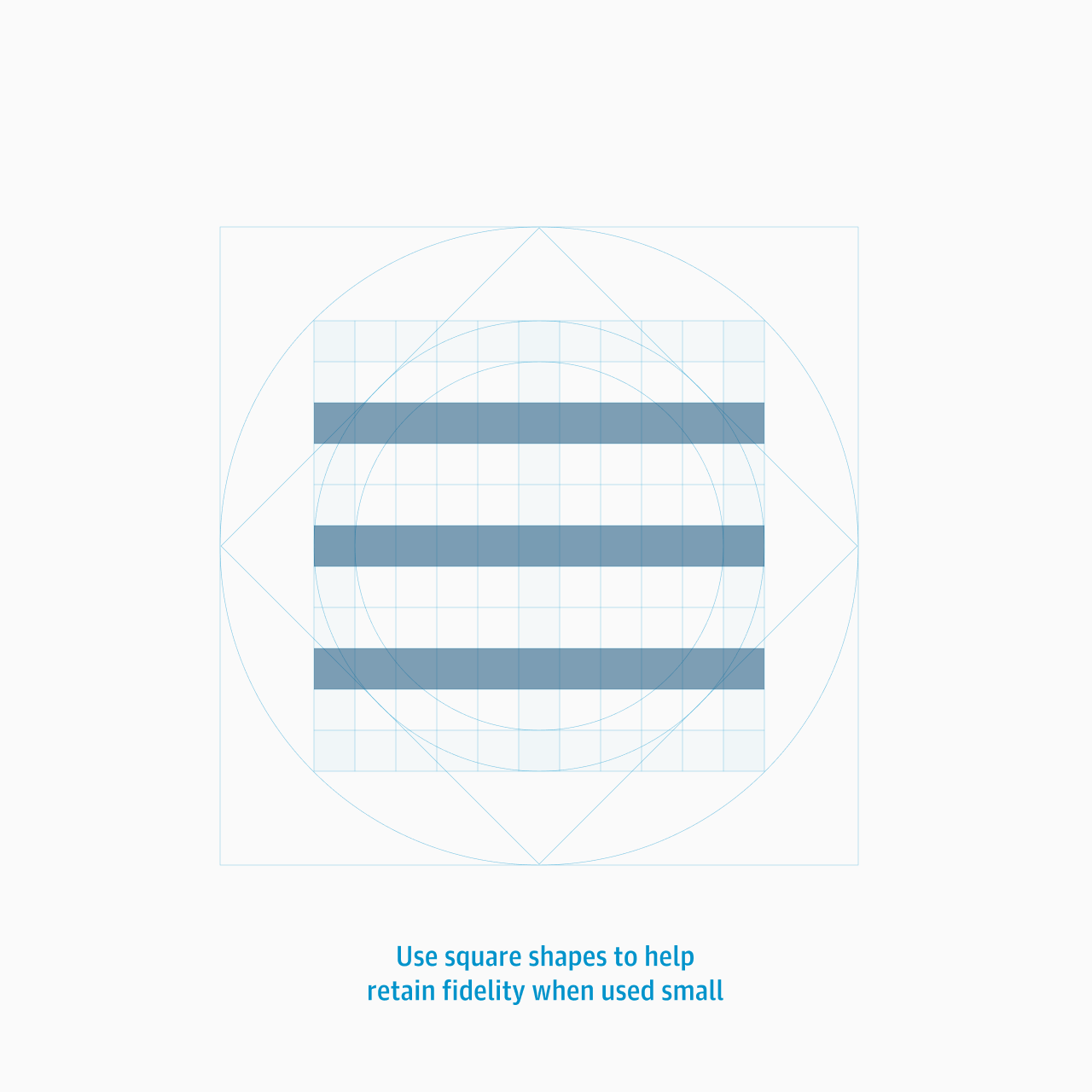
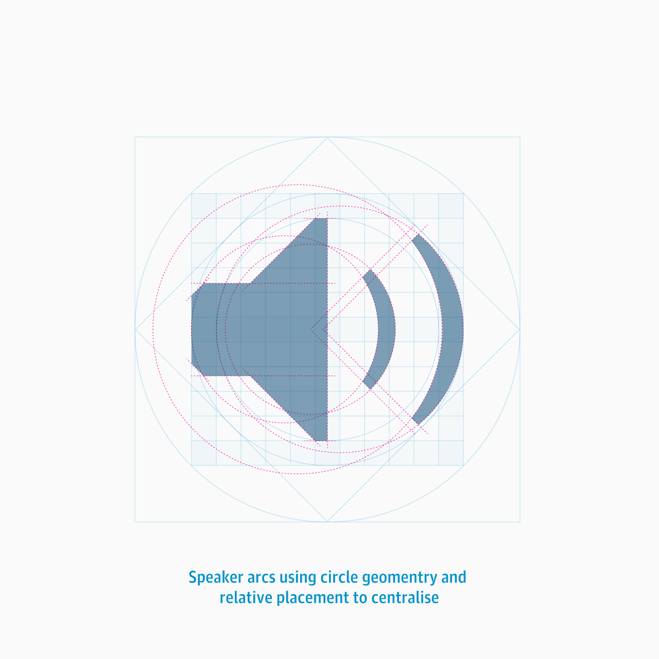
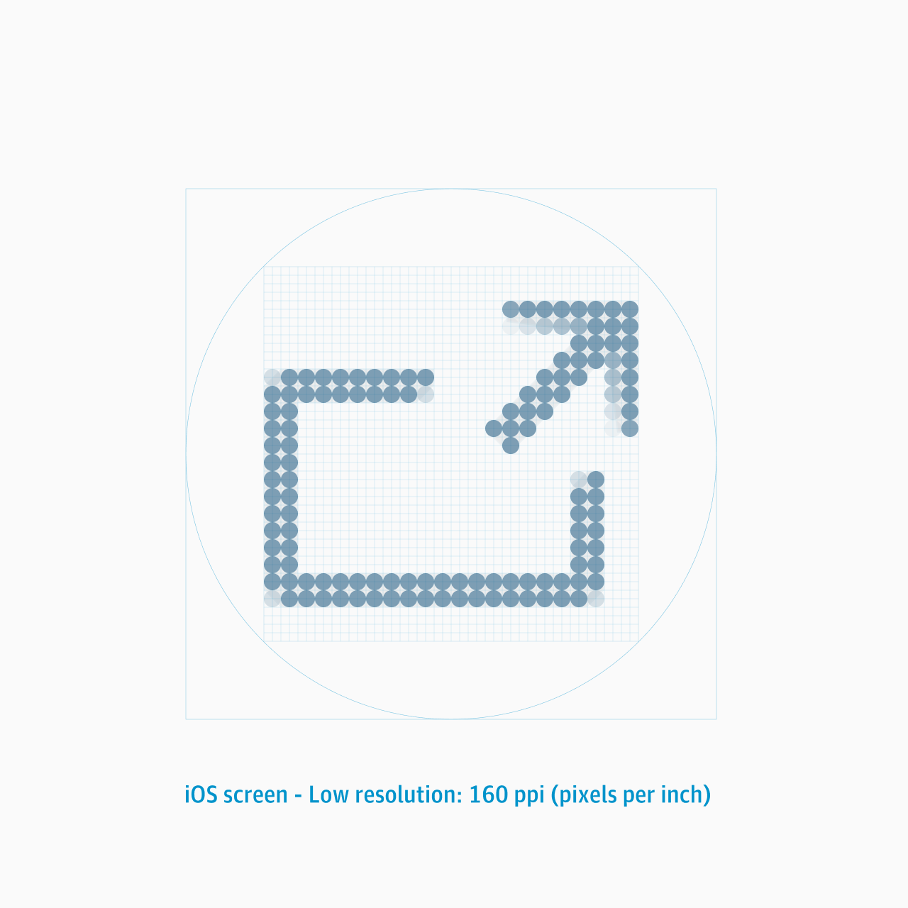
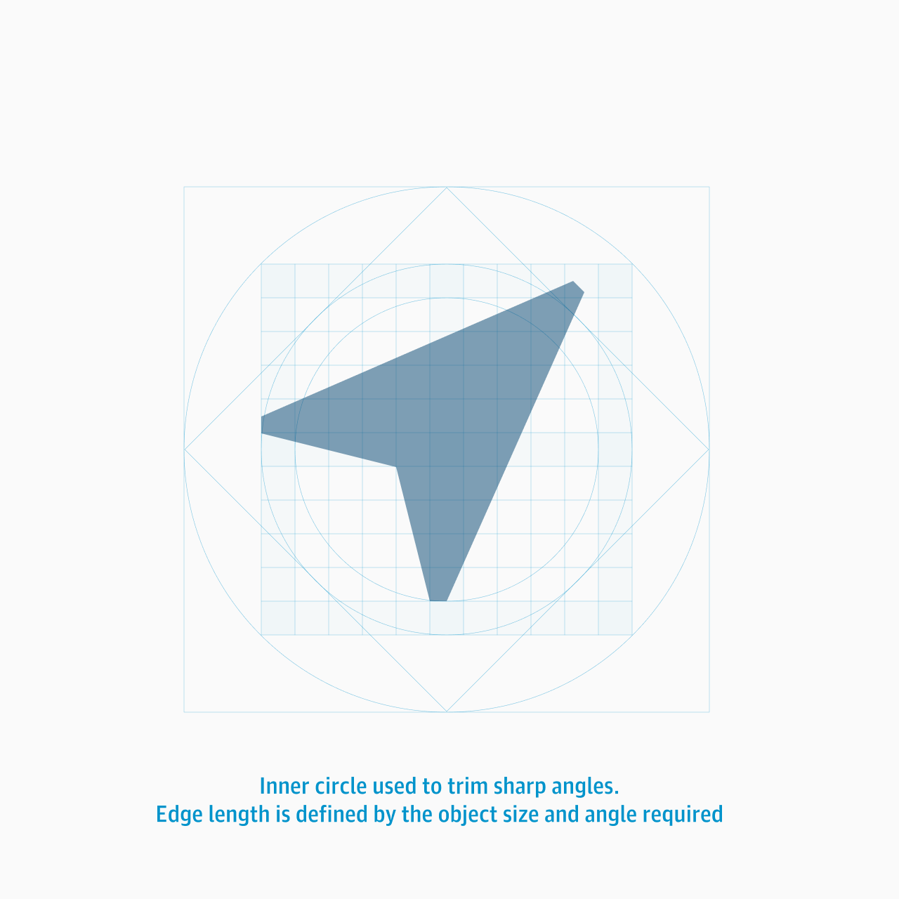
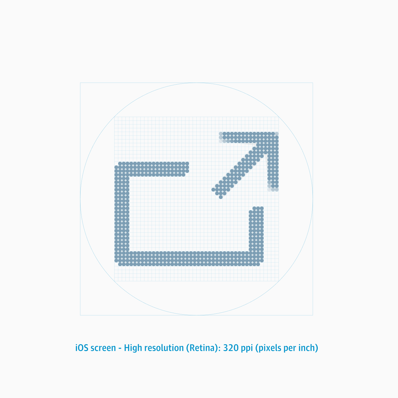
Structure and integrity
The initial collection of 80 icons were to be used with a standard circular frame. I constructed a dedicated grid system to define proportions, stroke weights, and alignment, ensuring the entire set felt precise and consistent across every application.
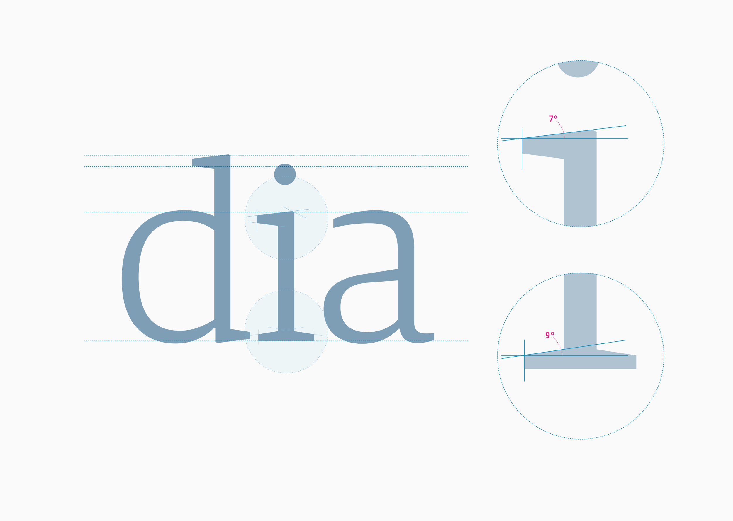
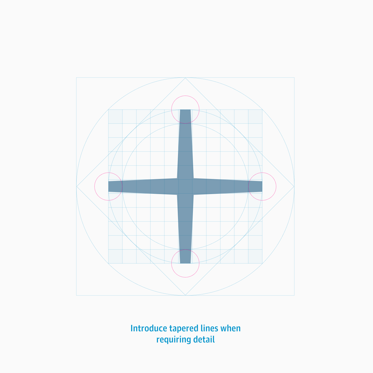
Typographic sensibility
My experience designing typefaces means I was sensitive to the subtle nuances required when building in details that resonated with the corporate font. It was essential the icon used the tapered stroke weight whenever possible to reference the serifs from the Egyptian font.
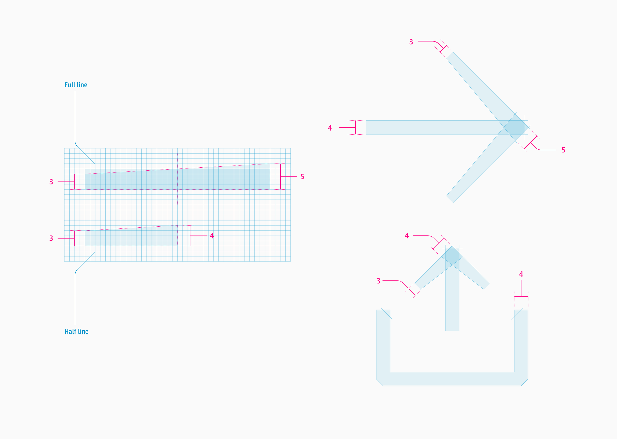
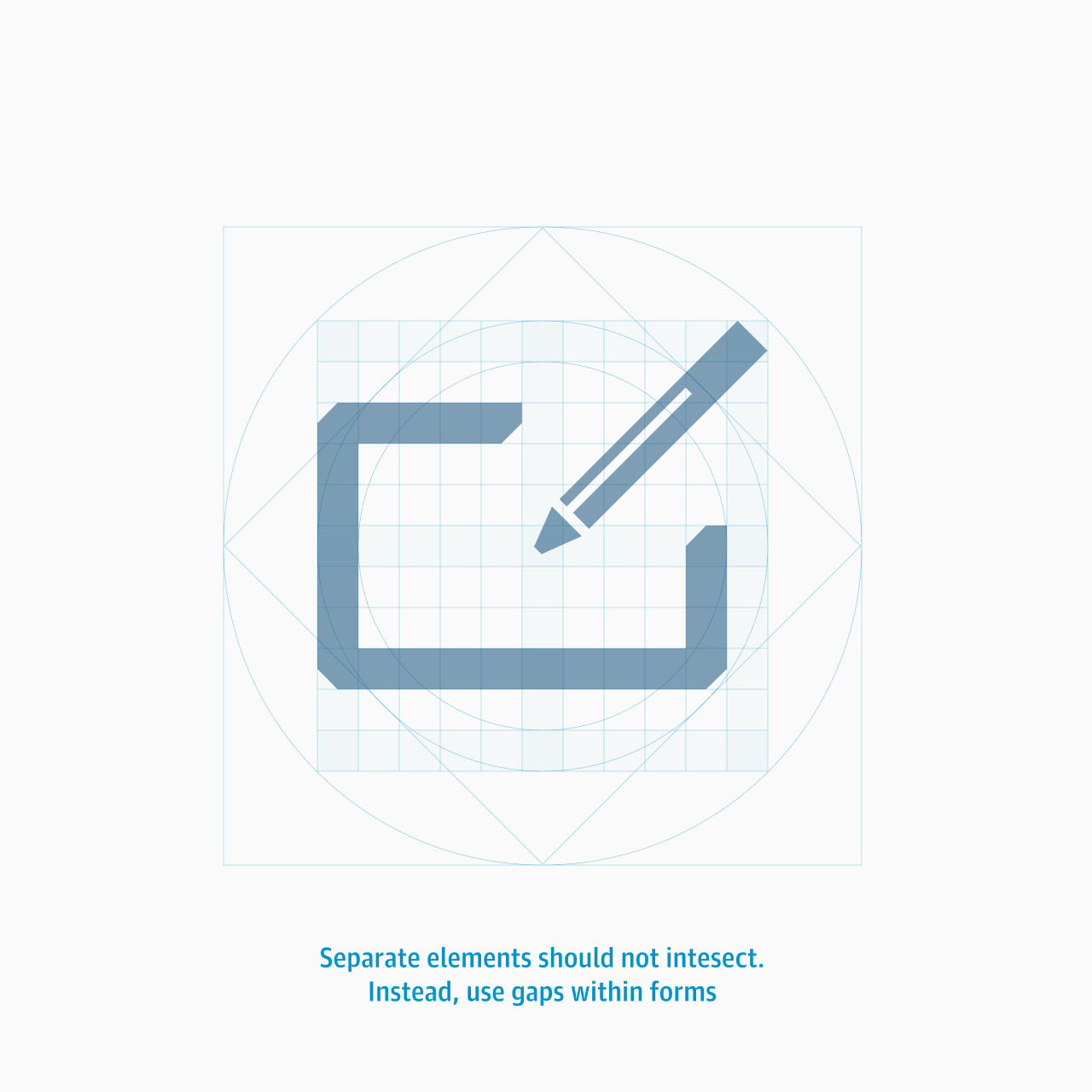
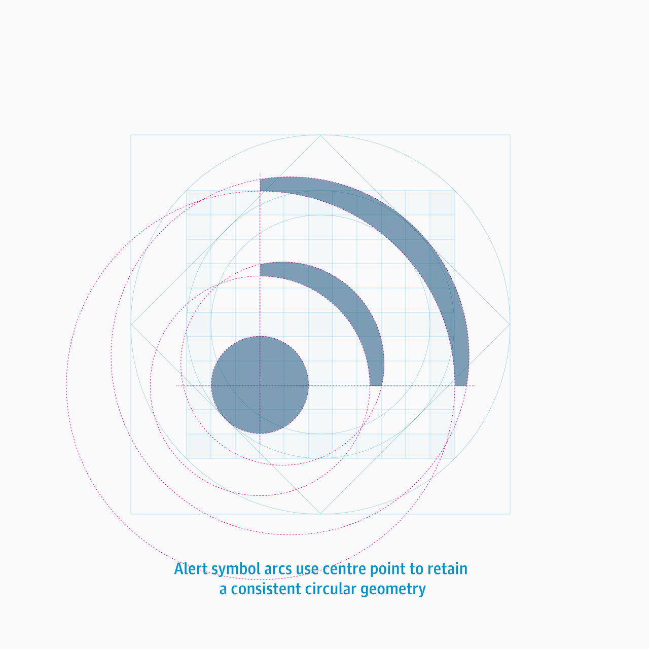
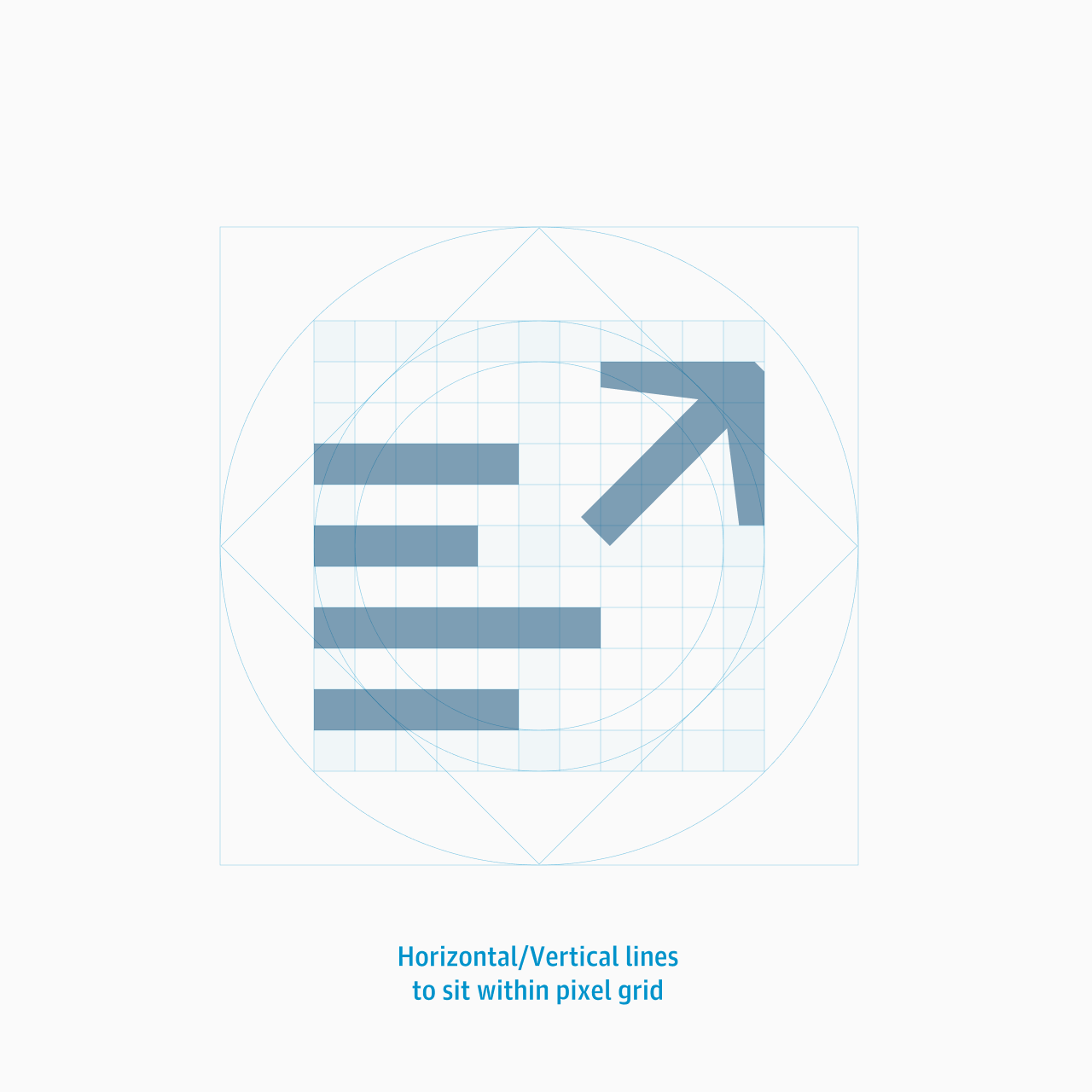
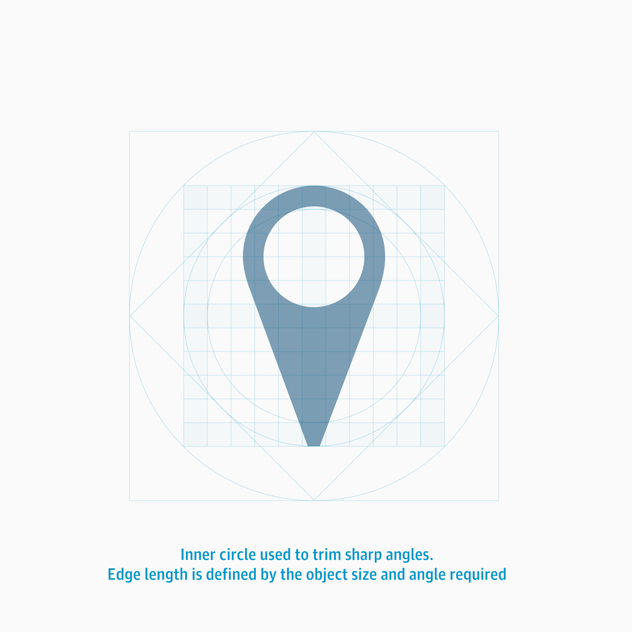
Consistency and balance
The following examples show the range of technique used to create the required consistency across the icon set.


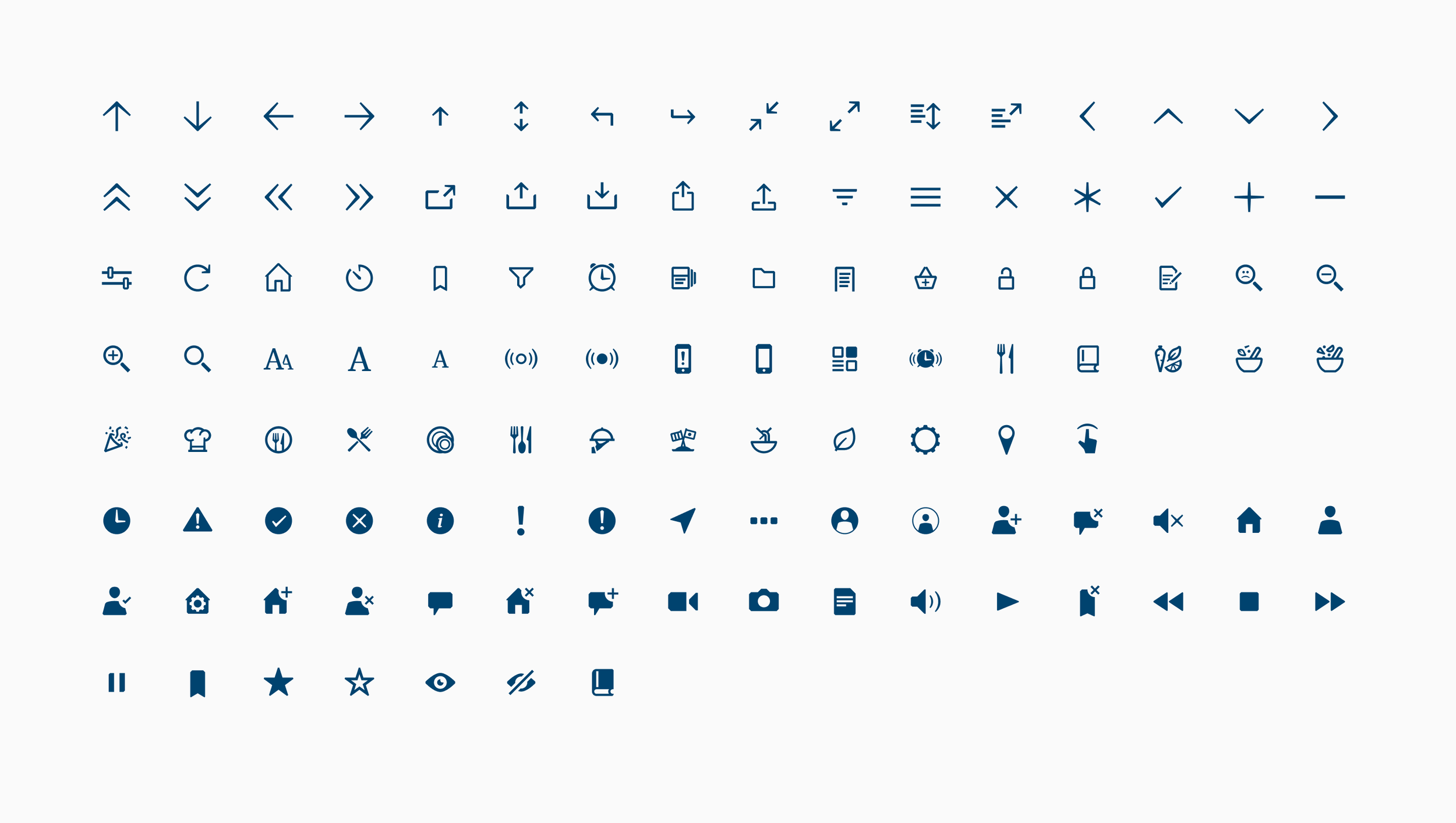
Full icon set
Below is the full set of icons. Over 100 were produced.